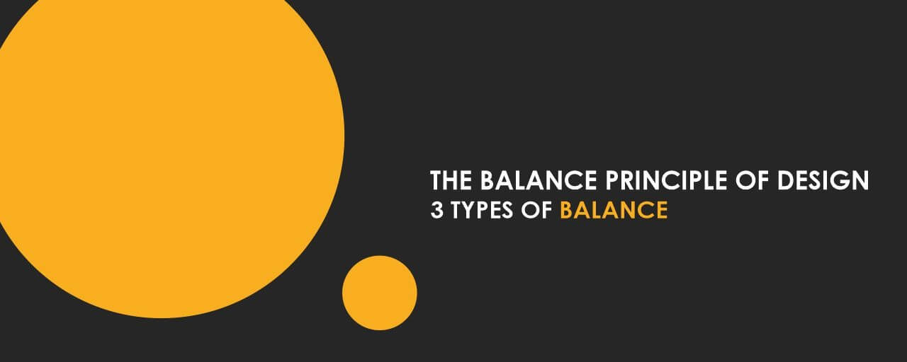
The Balance Principle of Design - 3 Types of Balance!
"Balance isn't something you find; it's something you create," as someone wisely phrased it. Balance has been defined as one of the most basic yet crucial aspects in the realm of design and art. A successful designer is one who understands the visual concept of balance and how to perfect it. At the MIT Institute of Design, Alandi we think that when a design achieves balance, which may occur with both symmetrical and asymmetrical designs, it achieves greater harmony, and your audience will expend less energy taking in the information.
But, before we even begin to comprehend Balance, do we have a clear understanding of what it is? The visual notion of balance is to make a design appear evenly weighted throughout the composition. The visual weight of your composition is measured by balance, which influences how much each piece catches your audience's attention. Here let us see the basic principle of balance in design with a deeper vision through this blog.
Balance In Design
The concept of design balance has been evident. Artists working during the Renaissance period, however, helped to formalise the concept. For example, in masterpieces such as the Vitruvian Man and The Last Supper, Leonardo da Vinci is known around the world for his precise attention to balance.
The namesake of the Vitruvian Man, Marcus Vitruvius Pollio, proposed that a temple should be proportioned similarly to a human body. He said this because he thought the human anatomy was in perfect proportion. This is the idea on which Da Vinci's picture was based. This clearly shows how important balance has been in the field of design ever since. Balanced designs offer a distinct focal point in the image, which is beneficial in the narrative. While pursuing a degree in design the basic principles are brushed off at the very initial stages of the course curriculum. Being one of the distinguished Design Institute in Pune, MITID, Alandi is one such institution that believes in starting from the very basic and navigating the top.
Types Of Balance In Design
In a composition, balance refers to the visual weight of the elements. Stability, structure, emphasis, and motion are all achieved through the application of balance. In design, one should try to arrange visual elements in an aesthetically acceptable order, or a specific arrangement, to achieve a specific style and feel or to fulfil a specific goal. Talking about the types of balance there are majorly three specific types of balance to be known and hence they are elaborated below:
Symmetrical Balance
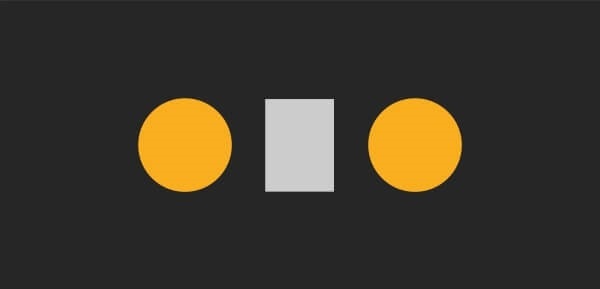
All the visual elements on one side of the screen are reflected on the other side if you draw a line down the middle of the page. They don't have to be identical, but they should be comparable in terms of number, colour, form, and scale. It is claimed that visual elements are in balance when their weight is equal. When a formal design, a sense of structure, organisation, and stability are desired, symmetrical balancing might be employed.
Asymmetrical Balance
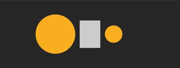
Asymmetrical balance is the opposite of symmetrical balance in that it is not the same on all sides of a centre line, i.e. it does not rely on symmetry. When multiple tiny visual elements on one side are balanced by a large visual element on the opposite side, or when smaller visual elements are placed further away from the screen's centre than larger visual elements, asymmetrical balance occurs.
Radial Balance
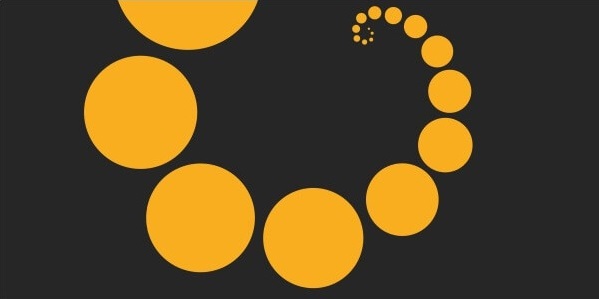
Radial balance is the third type of equilibrium, in which all constituents radiate in a circular pattern from a central point. Because all of the features guide your eye to the centre, maintaining a focal point in radial balance is fairly simple. A designer must determine which form of balance to use based on the intended goal or appearance and feel. A designer must be able to tell whether or not a piece is balanced. A strong visual effect and high-quality designs can be achieved with the use of good balance.
How Is Balance Included in Design?
Design, in any form, requires balance, as previously stated and explained. Product design, communication design, and user experience design are three of the most popular design courses at the MIT School of Design's Alandi. In these specialities, a student must investigate the basic application of balance. Only via examples and a thorough understanding of the subject will you be able to recognise the concept of balance in many forms of design, such as commercials or posters. Here are a few well-known examples of design that demonstrate the concept of balance.
Airbnb Logo
The Airbnb logo is one of the best instances of reflectional symmetry. According to the principle, if you draw a vertical line straight down the middle, both halves will be identical. Use simple shapes and opt for a minimalist logo with a few intricate pieces to achieve reflectional symmetry like this.
The Google logo is a good illustration of asymmetrical balance. The first three letters of the wordmark are substantially wider than the last three letters, giving the first half of the wordmark a stronger visual impact.
Apple
A magnificent example of outstanding reflectional symmetry can be found on Apple's Mac homepage. Not only are the MacBook screens the same length on both sides of the vertical, centre axis, but the lines of typography in the headline and subheading above are as well.
Harry Potter Movie’s Poster
The Harry Potter and the Deathly Hallows: Part 2 movie poster depicts the battle between good and evil in a beautiful equilibrium. The weight is evenly dispersed, giving us the sensation that the conclusion may be either triumphant or tragic.
Nike Logo
The Nike logo is designed with balance, movement, and rhythm, so don't be fooled by its simplicity. The ideal recipe for creating an iconic logo design. If you want to include tension and movement in your designs, asymmetrical balance is the way to go.
Balance In Colour Schemes
Colour plays an important role in our daily lives. Colour is used by nature to ward off predators, attract pollinators, entice partners, and advertise that fruit is ready to consume. No text is required for everyone who drives a car in a city and respects the traffic laws indicated by red, green, and amber lights. Colour is employed in advertising and design to capture attention and inspire interest in ways that would be difficult to achieve through other means. Colour has always been used to convey social position; for example, aristocracy and royalty are connected with purple, and colour has long been a source of symbolism in many cultures.
To sum up, balance can be found in every element of design, and to gain a thorough understanding of it, one must have an interest in and understanding of the Bachelor in Design degree.