Design Colour Theory, Explained
We believe in starting from the beginning of a topic or subject at the MIT School of Design. Colours, as one of the most significant parts of design education, must be thoroughly understood. Our faculty are some of the greatest, and we chose design faculties who excel in their disciplines, so they can provide Color Theory to interested design students.
Colour theory is both a science and an art form when it comes to working with colour. It covers how people see colour as well as the visual consequences of colours mixing, matching, and contrasting with one another. Colour theory also includes the meanings that colours convey as well as the ways for replicating colour. Colours are divided on a colour wheel into three categories in colour theory: primary colours, secondary colours, and tertiary colours.
Basic Understanding
Colour is a matter of perception. Our eyes see something (for example, the sky), and info transmitted from our eyes to our brains tells us it's a particular colour (blue). Objects reflect light in various wavelength combinations. These wavelength combinations are picked up by our brains and translated into the phenomenon we name colour.
What do you look for when you're strolling down the soft drink aisle, scanning the racks crowded with 82 million cans and bottles in search of your six-pack of Coke? Is it the written logo or the well-known red can? In 90 seconds or less, people decide whether or not they like a product. 90% of the decision is made simply on the basis of colour. As a result, colour must be a big aspect of your branding.
The Colour Theory
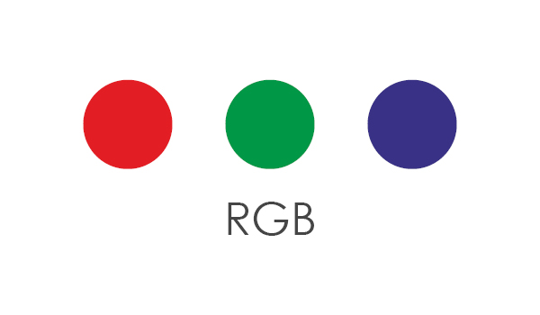
1. RGB
Mixing light, also known as the additive colour mixing model, allows you to generate colours by combining different intensities of red, green, and blue light sources. The brighter the colour combination becomes as more light is added. Pure, white light is created by combining all three colours of light.
Red, green, and blue (RGB) are the fundamental colours used in TVs, displays, and projectors, and they are mixed together to generate other colours.
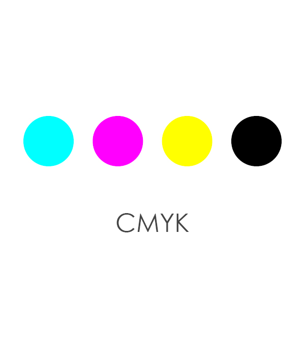
2. CMYK
The subtractive colour mixing model is used to create any colour you see on a tangible surface (paper, signage, packaging, etc.). This colour paradigm is more familiar to most people because it's what we learnt in kindergarten when we were mixing finger paints. "Subtractive" simply means that you are subtracting light from the paper by adding additional colour in this situation. The primary colours used in subtractive processes were traditionally red, yellow, and blue, as these were the colours that artists combined to create all other hues. They were superseded by cyan, magenta, yellow, and key/black (CMYK), which enabled printers to create a wider spectrum of colours on paper when colour printing became more popular.
These three properties - hue, color, and value - empower a designer to use a range of colors, which all help evoke the mood and message behind a brand.
For a few examples, we can look at the financial industry. Many brands, including Bank of America and Chase, use blue in their logos. It’s probably not a fluke, either; the color blue symbolizes order, trust, loyalty, and security.
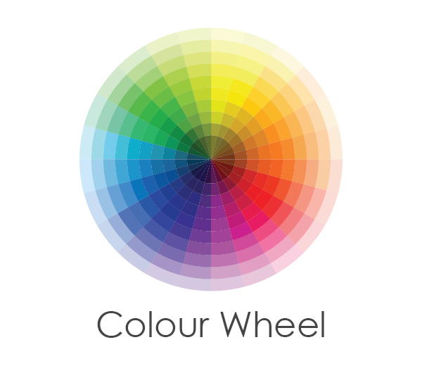
3. Colour Wheel
The first colour wheel was created by Sir Isaac Newton in 1666, thus it predates your kindergarten introduction to it. Colour harmonies, blending, and palettes are still developed using it by artists and designers. The colour wheel is made up of three primary colours (red, yellow, and blue), three secondary colours (green, orange, and purple), and six tertiary colours (colours generated when primary colours are mixed) (colours made from primary and secondary colours, such as blue-green or red-violet). Draw a line over the centre of the wheel to separate the warm colours (reds, oranges, and yellows) from the cool colours (blues, greens, and purples) (blues, greens, purples).
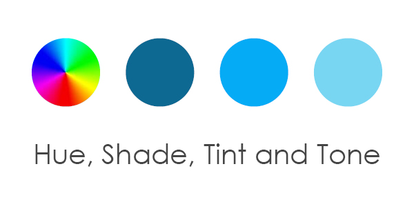
4. Hue, Shade, Tint and Tone
Tints, tones, and shades are colour wheel variants of hues or colours. A tint is a colour that has been lightened by the addition of white. Pink is created by combining red and white. A shade is a colour that has been given a black tint. For instance, the colour burgundy is made up of the colours red and black. Finally, a tone is a hue that has been enhanced by the addition of black and white (or grey). This darkens the original colour while making it appear less strong and subtle.
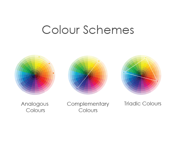
5. Colour Schemes
Designers create a colour strategy for marketing materials by using the colour wheel. There are majorly three types of colour schemes namely Complementary, Analogous and Triadic. Red and green, for example, are complementary colours since they are opposites on the colour wheel. On the colour wheel, analogous hues are close to each other—red, orange, and yellow, for example. One colour will dominate, one will support, and another will accent when developing an analogous colour scheme. Analogous colour schemes in the company are not only attractive to the sight, but they may also efficiently teach the customer where and how to behave. Triadic hues are vibrant and energetic and are evenly dispersed throughout the colour wheel. In marketing, using a triadic colour scheme generates visual contrast and harmony at the same time, allowing each item to stand out as the whole image pops.
Why Is Colour Theory Important?
You'll be able to make effective branding selections with this basic understanding of colours and colour schemes. For instance, what colour should your logo be? Or the psychology of colour selections on your website, such as the feelings that colours elicit in customers. Colour theory can help you not just with your own marketing, but also with understanding what your competitors are doing. You'll see a variety of comparable colour palettes when you compare three law firm web pages side by side. Blue is often connected with reliability, masculinity, and competence, whereas yellow is associated with happiness and competence. All of these associations are good in an area where negative connotations, such as dishonesty or hostility, are stereotypical.
Colour theory is important since it allows you to make your brand stand out and appeal to your target audience, as well as realise that bad colours can lead to bad sales.