The Basic Elements of Design
We believe in starting from the very beginning of a notion at the MIT School of Design. Because design is such a vital element of today's environment and economy, it's crucial to start at the beginning. The basic units of any visual design that compose its structure and communicate visual signals are known as design elements. Line, direction, shape, size, texture, value, and colour are the materials from which all designs are built, according to painter and design theorist Maitland E. Graves (1902-1978), who attempted to articulate the fundamental principles of aesthetic order in visual design in his book The Art of Color and Design (1941), which defined the elements of design as line, direction, shape, size, texture, value, and colour. This article written briefly explains the basic design elements and its uses.
What are the Elements of Design?
Great design does not happen by accident. Color, form, and typography are all factors that influence how a spectator or user perceives and interacts with a piece of work, and a smart designer intentionally chooses them. Certain design concepts, particularly when it comes to digital product design, can also make a design more functional; with the appropriate components in place, you can build meaningful experiences that effectively answer your user's pain points.
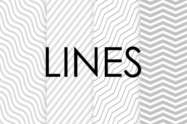
1. Lines
The line is the initial and most fundamental feature of design. A line is any two connected points in design. These lines might be smooth, rough, continuous, broken, thick, or thin, and they can be straight or curved. A line helps direct the user's eye to certain content or a specific focus point within your design by creating division and hierarchy.
Subliminal languages can also be created with lines in your design. For example, a diagonal line suggests movement, whereas a straight line is more tidy and neat. The graphic below, taken from the Virgin Hyperloop website, is a superb example of lines indicating movement.
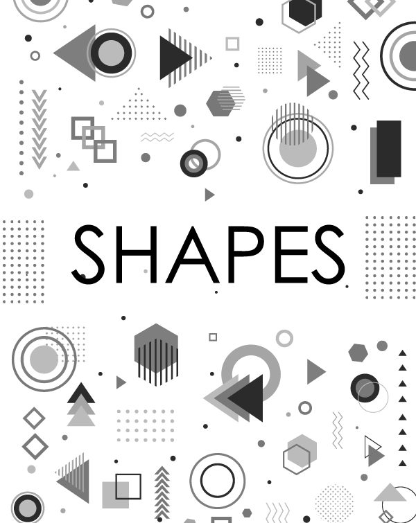
2. Shapes
Color is another powerful element of design. It can stand alone, act as a background, or highlight other elements in your design. Color is also a fantastic tool for creating and establishing a mood for your brand. For example, red typically signifies love, strength, power, and desire; green typically signifies tranquility, good luck, and health. As you create your color palette, it’s important to understand the three properties at play. This will help you maximize the power of this principle of design. These three properties are:
- > Hue refers to the name of the color. For example, “red,” “blue,” and “green” are all hues.
- > Saturation refers to the intensity or purity of the color. A specific hue can have a vibrant or dull saturation (and anywhere in between).
- > Value refers to the lightness or darkness of a color. Color can be “tinted” by adding white or “shaded” by adding a layer of black.
These three properties - hue, color, and value - empower a designer to use a range of colors, which all help evoke the mood and message behind a brand.
For a few examples, we can look at the financial industry. Many brands, including Bank of America and Chase, use blue in their logos. It’s probably not a fluke, either; the color blue symbolizes order, trust, loyalty, and security.
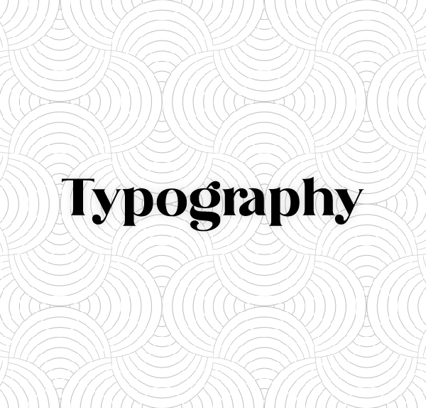
3. Typography
Typography is arguably the single most important part of graphic, web, and user interface design. Your text and how it looks isn’t just about conveying a message; it can also convey a mood. Are you a serious online newspaper or a playful blog? Typography can set the tone. For example, a Serif font like Times New Roman (below on the right) tends to evoke a more traditional and serious feeling, while a Sans Serif font like Open Sans (below on the left) reads as more modern. In addition to evoking a mood and feeling, typography can create visual hierarchy in your design. It can show people where to look and what things on the screen are most important, giving users a sense of how to read the material from beginning to end.
Larger font sizes, for example, catch the user’s eye first and signify a focal point on your page. When a smaller font is beneath it, the reader instinctually knows that it’s a subsection that will support the heading and perhaps provide more context or information. These smaller details of your font - including weight, height, and size - are all important as you consider typography in your UI design.
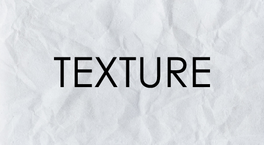
4. Texture
Texture refers to the way a surface feels - or in this case of a digital design, a perception of how it could feel. Texture can create a more dynamic, visually appealing experience while also adding depth to your design.
For example, a luxury linen brand that wants to imply comfort and coziness might consider a cotton textile background, like in the example below.stone, or brick background with grittier, textured typography to accompany it.
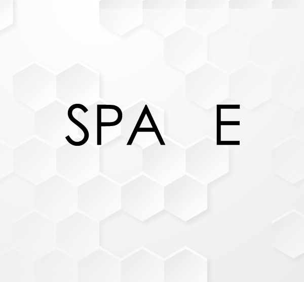
5. Space
The area above, below, surrounding, or behind an item is referred to as space. It can be favourable or unfavourable. The subject or areas of interest, such as a person's face or the furniture in a room, are referred to as positive space. Negative (or "white") space, on the other hand, refers to the space in the background that surrounds the topic or points of interest.
Negative space, when used effectively, is critical to the success of your design. It has the power to do the following:
- > Increase legibility - More white space means your content isn't competing with other design components.
- > Simplify your design - White space divides your design into parts, preventing your reader's eye from being overwhelmed.
- > Humans naturally see closed shapes, therefore complete a picture. As a result, when a shape or element is missing, the white space can instinctively assist your reader in filling in the blanks.
- > Add a touch of luxury - "Less is more" might help your design feel more sophisticated.
How are these elements applied?
Now that we've learnt the six design components, it's up to you, the designer, to put them into practise appropriately and successfully.
To make this process easier, most brands create a design system, which is a collection of reusable functional features, components, and colours. You can quickly reproduce a consistent experience for your users if you have a brand book or style guide to refer to.
Let's review everything we've learned so far:
- > A line can be used to separate portions of your page or to draw your reader's attention to a certain area.
- > Shapes may be seen in a variety of places in your design, from logos to images to many other aspects.
- > Color aids in the evocation of emotions and the establishment of an atmosphere in the design.
- > Typography communicates the tone of your page to users and aids in the creation of visual hierarchy in your design.
- > Texture gives your design a visual vibe.
- > Finally, positive and negative space can help you make the most of regions when there are no design features.
We at MITSD hope you feel empowered to develop meaningful, powerful, and successful designs now that you have the knowledge.